
A lesson in colour…
Some of the best colour combinations were invented long before anyone opened a Dulux fan deck.\
Think of figs cut open beside dark green leaves. Artichokes piled together at a market. Blood oranges, their vivid interiors almost glowing against their rough skins. Aubergines with their deep, inky purple and glossy surfaces. A bunch of dusty pink roses wrapped in brown paper. The chalky green of olive leaves beside terracotta pots.
Nature has an amazing way of combining colours better than the rest of us.
And the wonderful thing is that it doesn’t seem to try very hard. Colours sit beside each other without any apparent consideration for whether they’re on trend. They simply work.
I often think we look too hard for inspiration when it is happening everywhere around us. A trip to the markets, a plate of food, the beach after the rain, the faded exterior of an old building.
Sometimes an entire interior starts with something as uncomplicated as noticing that two colours look wondertul beside each other.
And then there is texture, which is just as important as colour.
The powdery surface of a stone, the uneven skin of a fig, the grain of old timber, or the soft, chalky finish of a weathered wall. Colour rarely exists in isolation. The surface it sits on changes the way we see it, and sometimes that is what makes a combination so interesting.
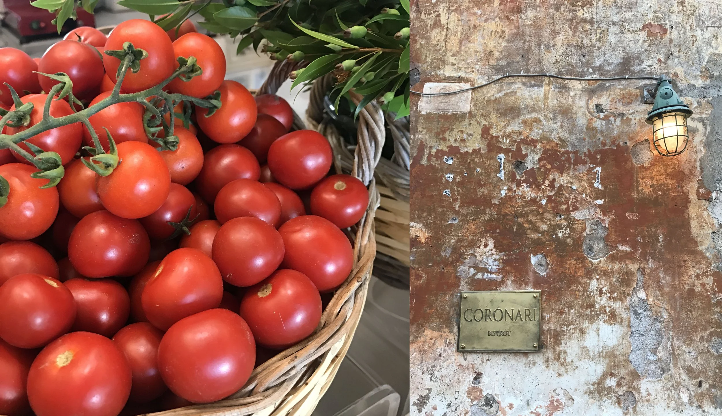
One of the best examples I've come across recently is a beautiful old wall in Rome.
It's not a grand architectural landmark or a perfectly restored
façade. In fact, it's the sort of wall you could easily walk past without giving it much thought, unless, like me, you have a habit of stopping to look at things that probably aren't on anyone else's sightseeing itinerary.
But look at those colours.
Rust, burnt orange, terracotta, dusty pink, warm grey and chalky white, all layered across the surtace. There are patches where the render has worn away, revealing what lies beneath. Some areas are smooth and faded, while others are rough, broken and almost sculptural. The colours bleed into each other, overlap and interrupt one another in a way that would be very difficult to reproduce deliberately.
And then there are the little imperfections. The marks, the cracks, the exposed patches and the remnants of what was once there.
“Rust, burnt orange, terracotta, dusty pink, warm grey and chalky white, all layered across the surtace. ”
It's a beautiful reminder that not everything needs to be new, polished or perfectly finished to be extraordinary.
Looking at a wall like this, I find myself wondering about everything it has witnessed. The people who have walked past it, the changes to the street, the seasons of sun and rain, and all the layers of paint and render that have accumulated over time. It feels as though history has been left on the surtace, rather than hidden away.
There is something rather wonderful about that.
In a world where we spend so much time choosing finishes, selecting colours and deciding exactly how a space should look, this wall has arrived at its palette without a designer, a mood board or a single caretully labelled sample.
Although, admittedly, I would quite happily take a few colour references from it.
I can imagine a warm, earthy interior inspired by those rusty oranges and taded pinks, with chalky whites, natural stone and aged timber. Perhaps a little dark green to bring some depth into the mix. Nothing too polished or contrived. Just a collection of materials and colours that feel as though they belong together.
Of course, the challenge would be resisting the temptation to make everything match too perfectly. The beauty of the wall is precisely that it doesn't.
And that's something I think about quite often when working on interiors. Sometimes we can become so focused on getting every colour and finish right that we forget what makes a space feel interesting in the first place. Not everything needs to coordinate, and not every surface needs to look brand new.
A little variation, a bit of texture and the occasional unexpected combination can be what gives a room its character.
The same applies to nature. A garden isn't beautiful because every leaf is the same shade of green. A market stall doesn't need to arrange its produce according to a carefully considered colour scheme. And a beautiful old building doesn't need to have every imperfection repaired to make it worth looking at.
Sometimes, the most interesting things are the ones that have been left alone.
I suppose that's what I love about looking for colour inspiration outside the usual places. It encourages you to pay attention. To notice the colours in a meal, the way the light changes the appearance of a building, or the beautiful combination of materials that someone has put together without giving it a second thought.
You don't always need to go searching for inspiration. Sometimes you just need to look a little more carefully at what's already there.
And if all else fails, there's always a very good excuse to spend an afternoon wandering around a Roman street, admiring an old wall.
Purely for research purposes, of course.
